


Design inspiration
The Story of Te Aka Mauri
The land on which Te Aka Mauri sits was gifted by Ngāti Whakaue when the city of Rotorua was built. Much of our design inspiration has come from local marae and history and reflects the shared Te Aka Mauri vision to create a facility of excellence to advance community wellbeing and understanding.
Te Aka Mauri's logo was inspired by the tukutuku panels at Tamatekapua Marae at Ohinemutu, Rotorua. It also draws inspiration from the concept of open books representing open minds and the cross representing healthcare. The colours of Te Aka Mauri's logo are placed in the same order as the colours of the respective floors – blue is the colour of the top floor, then red, yellow and green.
Our iwi reference group Ngā Mahinga Toi provided guidance to ensure that Te Aka Mauri showcases Te Arawa's unique identity and reflects culturally and spiritually appropriate Māori design. There are three guiding principles chosen by them – being enlightenment, discovery and collaborative strength. These are personified by Tāne, Ihenga and Tāwhaki.
Tāwhaki-nui-a-Hema used vines to make his climb to the heavens in pursuit of knowledge and wellbeing and this is represented by a sculpture hanging from the ceiling in the children's collection. Tāne is honoured by the use of wood throughout the building, and by the placement of the tree on the ground floor and the tremendous light this will be bathed in via the atrium above. Ihenga, the grandson of Tamatekapua, was a great explorer responsible for the discovery and naming of many Te Arawa mountains, rivers and lakes, the Kaituna, Rotoiti and many more.
Each floor has its own name, health focus, pattern, and colour. All of the patterns used in Te Aka Mauri's design have been inspired by tukutuku at Tamatekapua Marae.
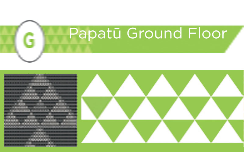
Papatū - Ground Floor
Ngā Koromatua e ono o Ngāti Whakaue
This is a sign of Tohunga/historians/chiefs and represents family houses within a tribe and also hospitality.
The health focus of the ground floor is Wai Ora - Health and wellbeing. The pattern was inspired by the tukutuku pattern Niho Taniwha and green represents Papatuanuku, the nurturer.
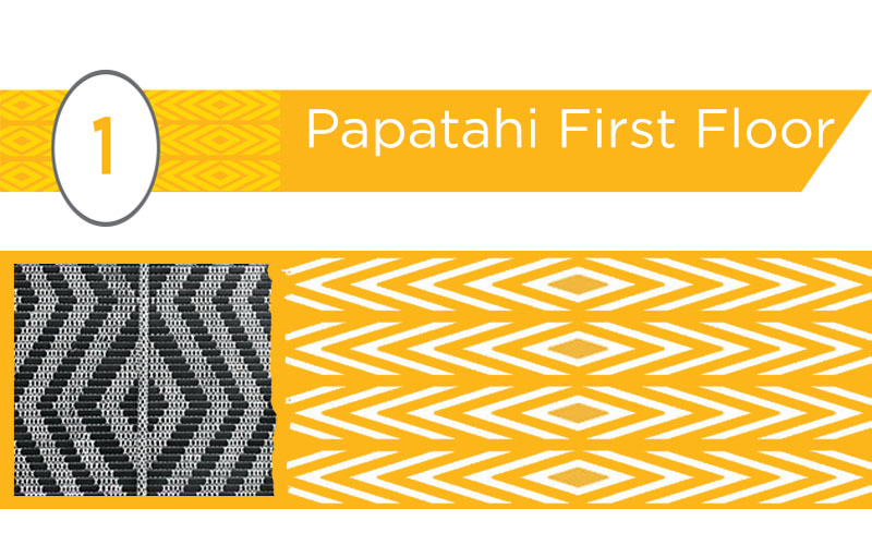
Papatuatahi - First Floor
Ngā Pūmanawa e Waru
This signifies manaakitanga, nurturing the potential of the future generations.
The health focus of the first floor is Manawa Ora - Hope and the breath of life. The pattern was inspired by the tukutuku pattern Whare Tangata and yellow represents the distinctive sulphur influence of the district.
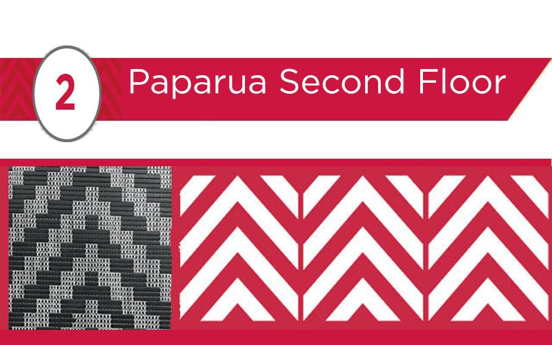
Papatuarua - Second Floor
Ngā Mātā Waka
This is unique to Te Arawa and symbolises the voyage of the Te Arawa waka from Hawaiki to Maketu, and the travels of all people to the region.
The health focus of the second floor is Hau Ora - Winds of Wellbeing. The pattern was inspired by the tukutuku pattern Te Ara and the colour red links to the geothermal activity of the region.
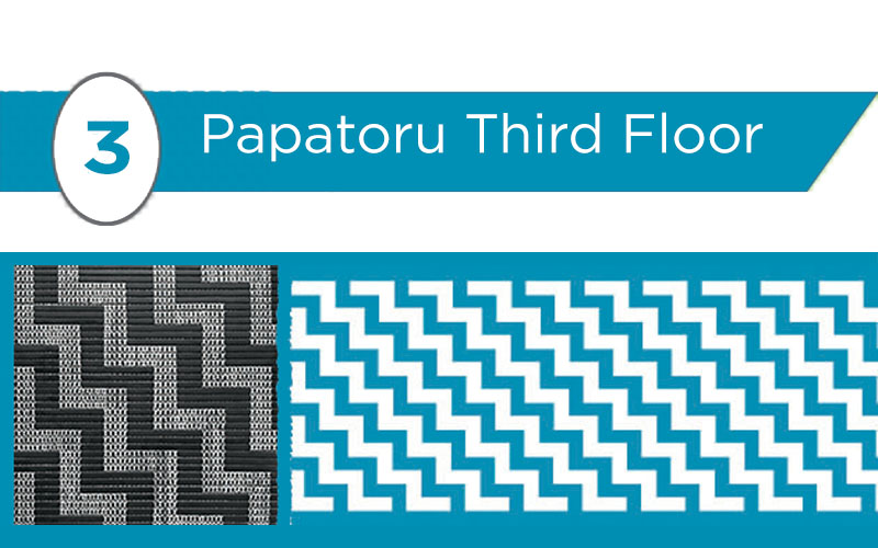
Papatuatoru - Third Floor
Te Heketanga a Rangi
Signifies levels of achievement and the advancement of man pertaining to religion, education, health and wellbeing – physically, spiritually and mentally.
The health focus of the third floor is Toi Ora - Utmost wellbeing. The pattern was inspired by the tukutuku pattern Poutama. The top floor is coloured blue to represent Ranginui with references to Matariki on its walls and in its artworks.